

The Popularity of Grey in Modern Design
In recent years, the use of grey in modern design has become increasingly popular. It is a color that can be seen everywhere, from web design to fashion, interior design, and graphic design. Its versatility and ability to adapt to any setting make it a go-to color for designers. But within the realm of grey, there are sub-shades that stand out, namely pale grey, light grey, and Pantone grey. Let’s explore the characteristics of each shade and its prominent use in modern design.
Pale Grey: A Soft and Soothing Shade
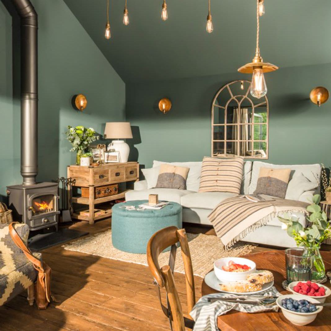
Pale grey is a subtle, soft, and soothing shade that exudes elegance and sophistication. It is a popular choice for minimalistic and contemporary design, where the focus is on creating a calming and uncluttered atmosphere. Pale grey is commonly used in web design, where it serves as a neutral background color that enhances the readability of text and highlights other design elements. In interior design, pale grey walls can create an illusion of more space and offer a blank canvas for you to introduce pops of color through furniture and accessories.
Pale Grey in Fashion
In fashion, pale grey creates a refined and timeless look. It is often paired with whites and blacks to create a monochromatic outfit that is both chic and effortless. Pale grey suits are a popular choice for formal events where black suits may be too harsh and white suits too bold. Additionally, pale grey knitwear is an excellent way to add texture and dimension to an outfit without introducing too much color.
Light Grey: A Versatile and Practical Shade
Light grey is a versatile and practical shade that can be used in many different settings. It is slightly darker than pale grey and can be used to create a more muted, calming effect without darkening a room too much. Its adaptable nature makes it a great choice for graphic design, where lighter tones are needed to create contrast and hierarchy in design elements. Light grey is also commonly used in branding and logos, offering a reliable and trustworthy image for a company.
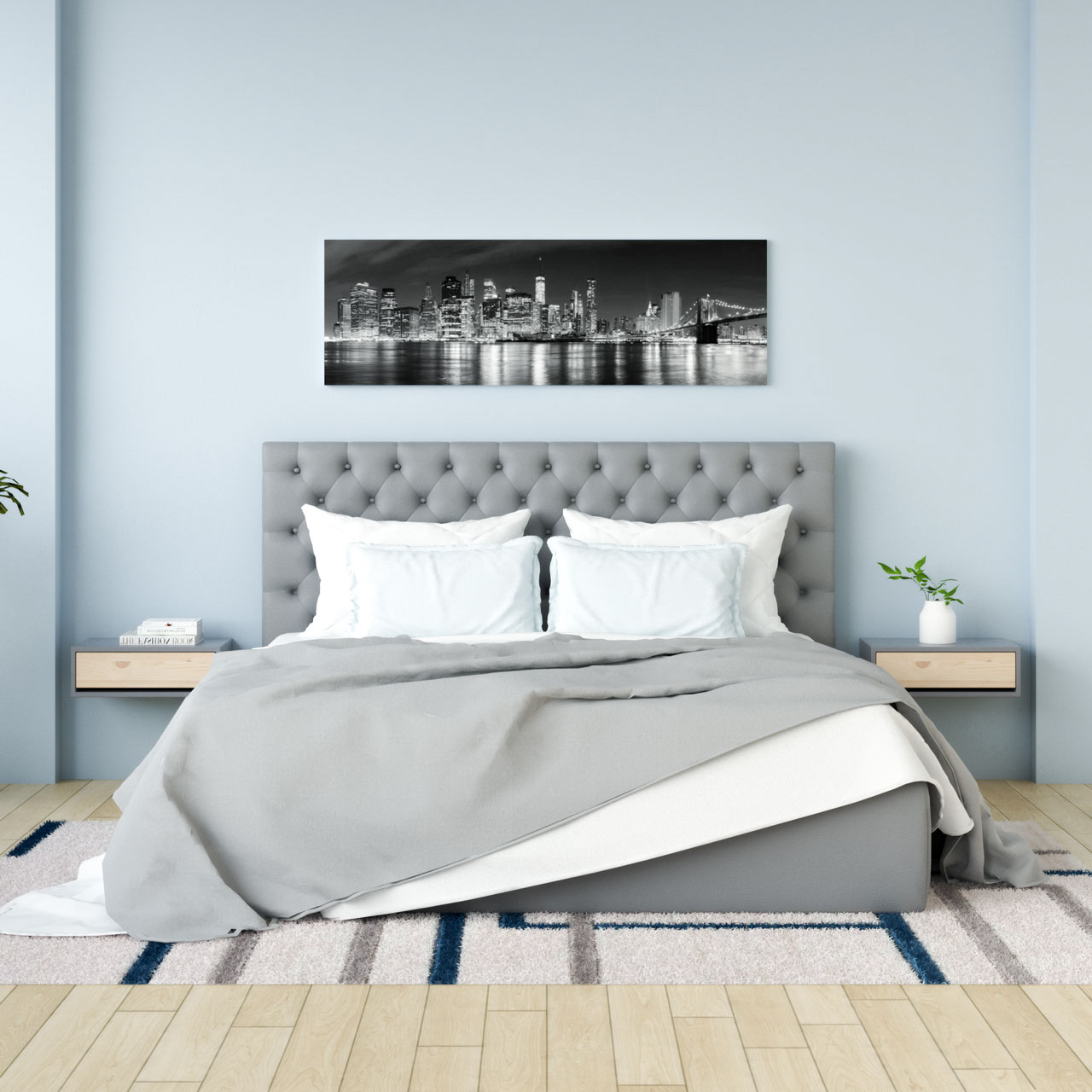
Light Grey in Interior Design
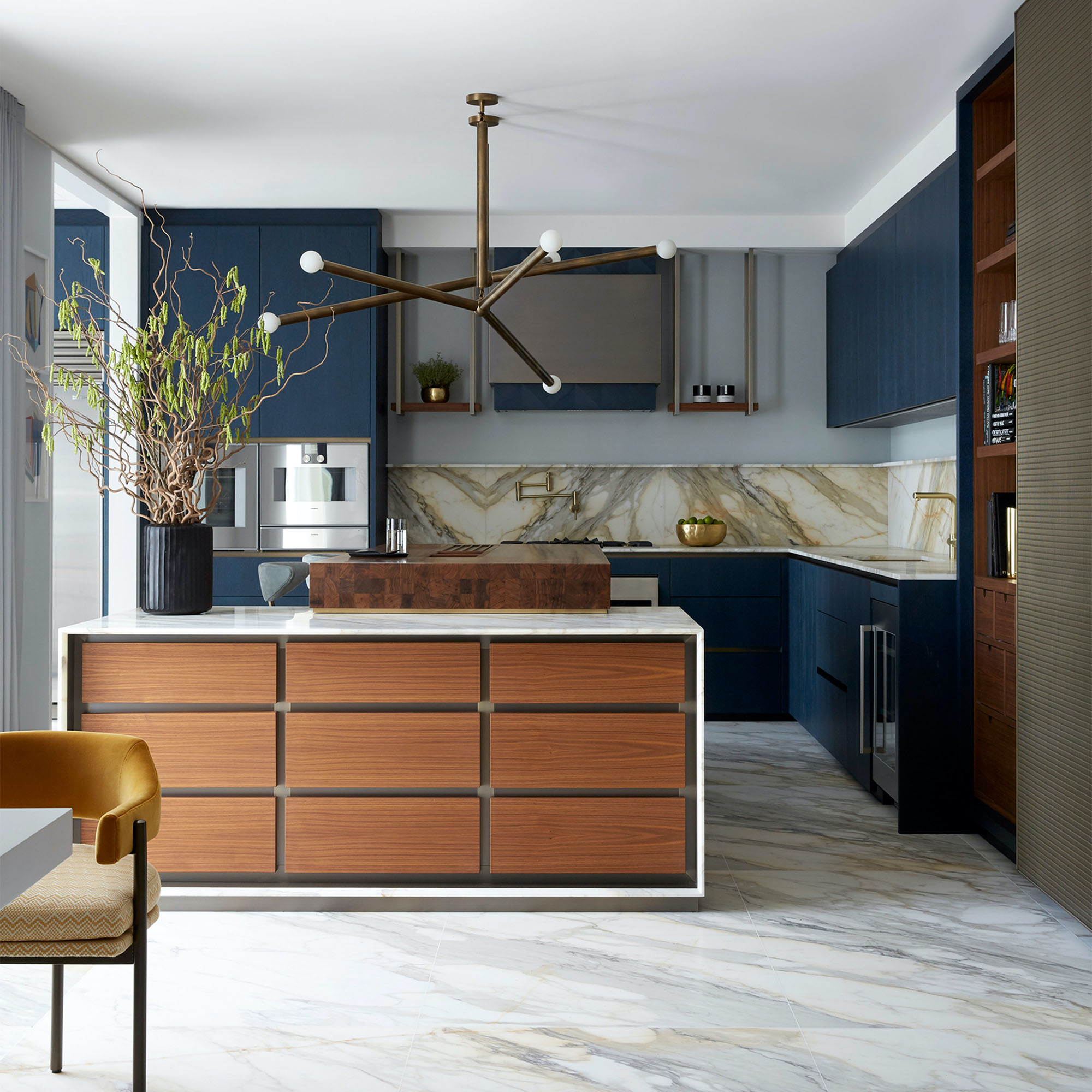
In interior design, light grey is often used to create a neutral and calming environment. It is an excellent choice for large pieces of furniture such as sofas and carpets, as it is less likely to show stains and dirt compared to white. It is also a popular choice for kitchen cabinets and countertops as it creates a clean and modern look.
Pantone Grey: A Timeless and Classic Shade
Pantone grey is a universal shade of grey that can be seen across various design industries. Pantone is the standardized color matching system used globally, making Pantone grey a reliable shade for designers to use. It is a timeless and classic shade that is often used for branding and corporate designs. It creates a sense of professionalism and stability and is an excellent choice for businesses that want to portray those characteristics.
Pantone Grey in Graphic Design
In graphic design, Pantone grey is commonly used in corporate designs such as business cards and stationery. It is a popular choice for logos, offering a sleek and modern image for companies. Pantone grey can also be used in packaging design, creating a minimalistic and elegant look that highlights the product’s packaging.
In modern design, there is no denying the popularity of grey. Its versatility, practicality, and timeless appeal make it an excellent choice for designers across all industries. Pale grey, light grey, and Pantone grey are each unique in their own ways and offer different characteristics that are useful in various design settings. Whether used as a neutral background or a sleek branding element, grey will continue to be a significant color in design for years to come.